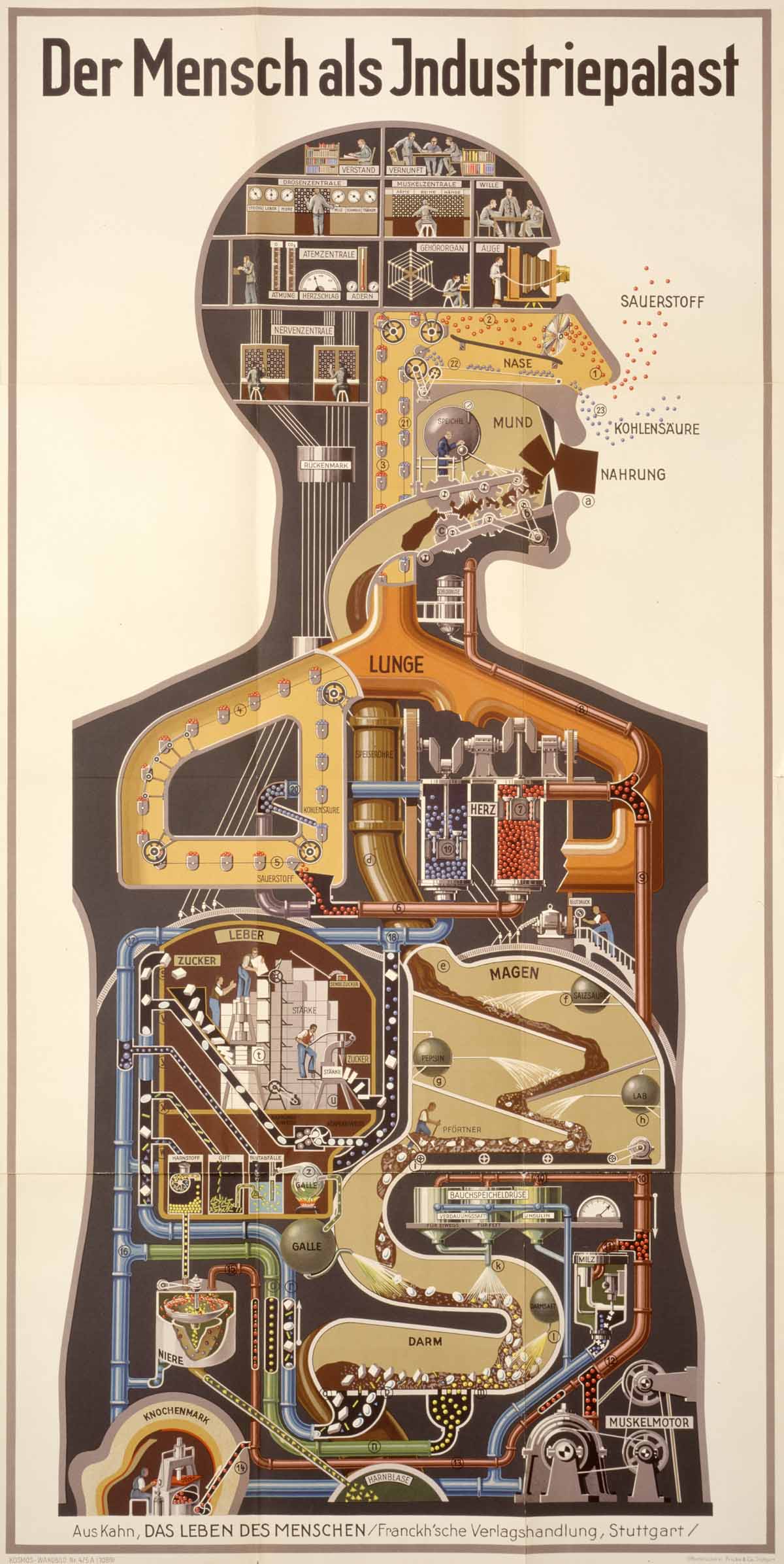
Kahn, a former gynecologist, ran with the man-as-machine analogy like nobody else. That analogy has some problems, of course, but it makes a good foundation for beginners learning about human anatomy (you know, for kids).
Learn more about Kahn here and more about Lederer’s piece here.
Star Wars enthusiast Jambe Davdar has created a three-part “expanded commentary” for the original trilogy. He has re-cut the original movies, stitching in audio from cast, crew, etc. interviews, Pop-Up-Video-style text commentary, behind the scenes footage, deleted scenes and more. His cuts, Star Wars Begins, Building Empire, and Returning To Jedi, are available in 61 parts on YouTube. Metafilter has the links (along with a discussion).
To give you an idea, here’s the fourth section of Building Empire:
How great is the cut to the Marvel comic? I’m enthralled because this is Star Wars, of course, but also by the original mesh of documentary and commentary track. This is the first time I’ve seen anything in this form: essentially, a making-of documentary woven into context. I expect the studios will give this kind of commentary a go, too. If they hustle, Lucasfilm could bang out their own version for the Blu-Ray release.
Explaining bonus: Mr. Davdar has a blog with some information on how he made his making of.
Our vision is to be a powerful and innovative force. Bringing together different disciplines and perspectives, we will bring new ideas and urgent and provocative debates to a mass audience. We will work with partners to generate real progress in our chosen project areas, and through our Fellowship we will be seen as a source of capacity, commitment and innovation in communities from the global to the local.
Best of all, they’re doing it through cartoons, at least in part. RSA Animate is a video series that couples RSA public lectures with wonderful illustrations that follow along with what the speaker is saying.
I found these via a Flowing Data post, which describes the videos a “a different take on the infographic.” That description and the name RSA Animate don’t quite hit the mark for me. The cartoons don’t really represent data or processes visually, and they’re not animated, for the most part. The studio that makes them, Cognitive Media, uses the term “Scribing,” which works well. The form is more like visual note-taking –the cartoons don’t explain things by themselves, but underscore particular points, helping those points to stick the landing in your brain.
I did something similar in school. In my margins, I’d make cartoons of pieces of art, historical North Carolinians, frogs, etc. to keep my mind from wandering*. I picked up the habit from Larry Gonick’s books, like The Cartoon History of the Universe, which have a lot in common with the RSA Animate series. In both, the cartoons are continually responding to the main narrative. It’s a highly effective mnemonic device, which makes it a great explaining tool– by pairing auditory or textual points with a related visual, you form more neural connections, which makes the ideas much stickier.
* I still do this in meeting sometimes, but more often, my doodling doesn’t relate to the subject matter. Brilliant scientists agree with me that this helps you concentrate.
Comic Book Cartography is the sort of thing I like, of course. Curator Half Man | Half Static has picked an enviable blog beat: cutaways, maps, diagrams, aerial views and other explanation staples from old comics.
I found this in a recent post from Khoi Vinn, who makes a great point related to this page specifically:
Looking at examples like the one above, a cut-away diagram of The Fantastic Four’s futuristic corporate headquarters, I defy anyone to argue that our current fascination with information graphics doesn’t originate, at least in part, from the kinds of schematic graphics like this that old comics routinely dealt in.
I’d go along with that. And like a good infographic popping in your RSS stream today, this stuff interrupted you, in a good way. You stopped and lingered. I need to go down to my basement archives for some evidence, but I think Mad Magazine deserves some credit/blame for the infographics glut, too. I’m thinking particularly of the two-page spreads showing a huge scene, with labels and such everywhere.
Here’s one more, which belong on the Explainist refrigerator:
(* for you non-comic-dorks, this was the title structure of nearly every mainstream article on comics between 1985 and 1995.)
In this TED talk, infographicist David McCandless nicely explains how and why he turns mountains of data into squares and bubbles and mountains and whatnot.


