I have a strong aversion to the “myThing” school of Web sites and apps, but I like the hot exploded action in this myLowes spot:
[via Quipsologies]
I have a strong aversion to the “myThing” school of Web sites and apps, but I like the hot exploded action in this myLowes spot:
[via Quipsologies]
Cash in a spare minute (or minute-and-a-half) for some good learnin’. Minute Physics is a growing YouTube channel of speedy marker doodle explanations:
I like the nice, simple style, an unembellished cousin to previously-discussed RSA Animate.
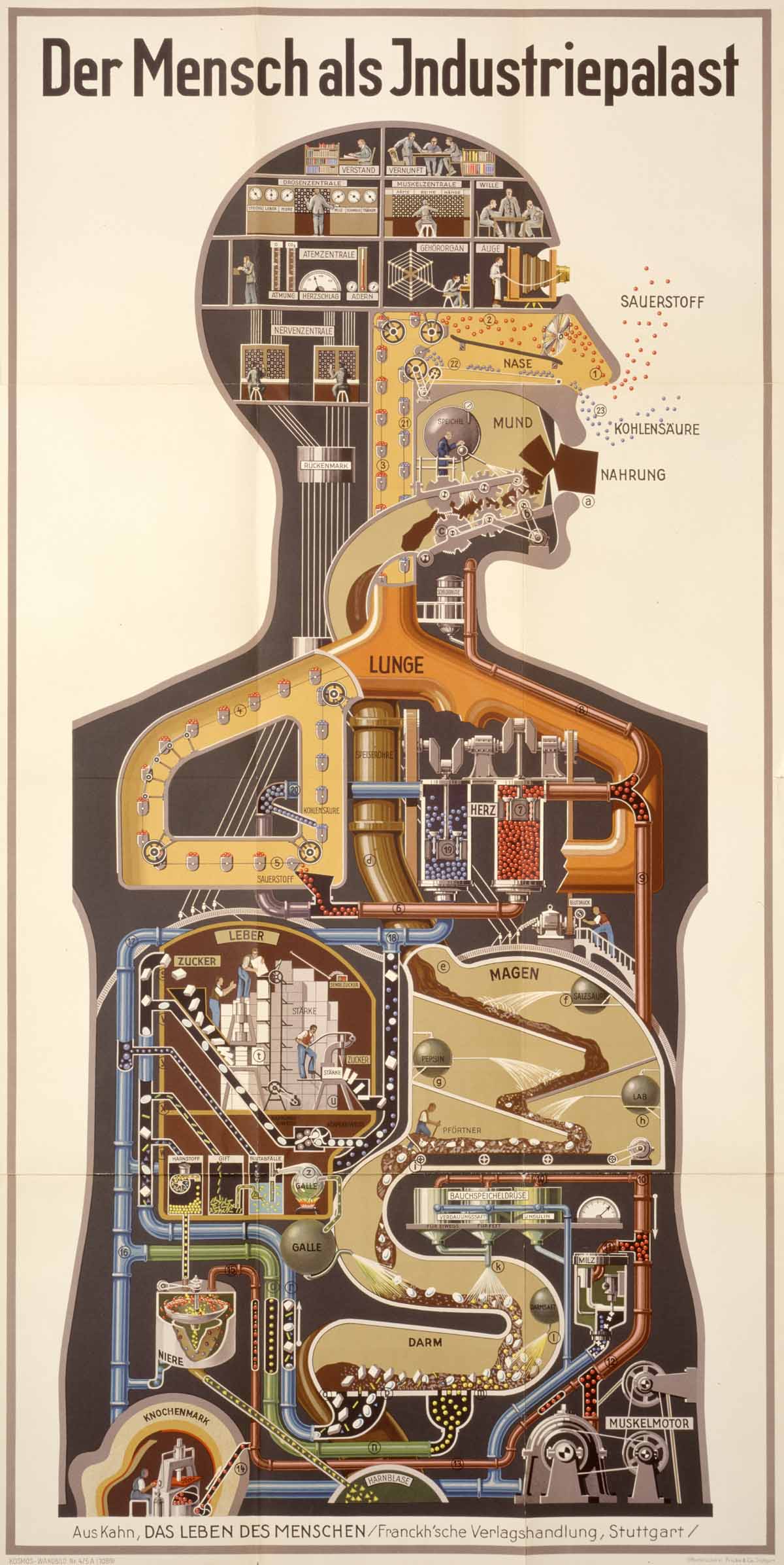
Das ist gut. In this video from an interactive art installation, Henning M. Lederer animates Fritz Kahn’s 1927 poster “Der Mensch als Industriepalast” (Man as an Industrial Palace).
Kahn, a former gynecologist, ran with the man-as-machine analogy like nobody else. That analogy has some problems, of course, but it makes a good foundation for beginners learning about human anatomy (you know, for kids).
Learn more about Kahn here and more about Lederer’s piece here.
Star Wars enthusiast Jambe Davdar has created a three-part “expanded commentary” for the original trilogy. He has re-cut the original movies, stitching in audio from cast, crew, etc. interviews, Pop-Up-Video-style text commentary, behind the scenes footage, deleted scenes and more. His cuts, Star Wars Begins, Building Empire, and Returning To Jedi, are available in 61 parts on YouTube. Metafilter has the links (along with a discussion).
To give you an idea, here’s the fourth section of Building Empire:
How great is the cut to the Marvel comic? I’m enthralled because this is Star Wars, of course, but also by the original mesh of documentary and commentary track. This is the first time I’ve seen anything in this form: essentially, a making-of documentary woven into context. I expect the studios will give this kind of commentary a go, too. If they hustle, Lucasfilm could bang out their own version for the Blu-Ray release.
Explaining bonus: Mr. Davdar has a blog with some information on how he made his making of.
Last night, I finally watched season 2 of This American Life (the TV version), and it wrung me out good. I’m a longtime fan of the radio show, and I thought season 1 of the Showtime series was great, but even so, I was surprised by the truth and beauty of season 2. The finale, “John Smith,” is one of the most affecting and genuine films I’ve ever seen. It’s 17 E.T.s worth of humanity.
Here’s the trailer for season 2:
Anyway, during my great-TV hangover this morning, I was looking up This American Life stuff, and rediscovered Ira Glass’ explanation of the elements of great storytelling. This is more than two years old, so you might have seen it already, but I wanted it to be here.
Chemistry was the toughest of all subjects for me in high school, and I expect something like this would have helped immensely: a periodic table backed up by a punchy video explaining every element.
Here’s good ol’ boron:
You won’t master basic chemistry watching these videos, but they do a great job making each element memorable.
[via @leahjones, by way of Dave]
Here’s another terrific explanatory video. This one meshes stop-motion animation with infographics to explain the importance of eating local food (in this case, Canadian local food).
The Canadian creative houses Oglivy Toronto, CRUSH, and Sons and Daughters created the spot for the Hellman’s Mayonnaise “Eat Real. Eat Local” campaign.
CRUSH creative director Gary Thomas explains what was involved in creating the video here:
We have done other interactive pieces, but this was far and away the biggest single project. For a start, it’s nearly three minutes long, involved a twenty hour shoot with two sets of stop frame animation, a month of CG pre viz where we literally built every shot in CG ahead of time so that everyone could be a part of the process. The schedule had a really tight finishing schedule so we really needed to have all the nuts and bolts worked out before the shoot.
We had a lot of Crush on this project at various points. Stefan Woronko and myself were initially responsible for the creative direction on the Crush side, taking the hard dry statistics and finding different ways to present them in our “world” (a family dinner table). We then added Yoho Yue and Gav Patel who added design and animation elements. The CG team consisted of department head Aylwin Fernando (who didn’t sleep very much), and a team four other animators. We also had four Flame artists led by Greg Dunlop who tracked cleaned roto’d and composited all the shots. We had Kim Knight at Crush Cuts as our editor so we were able the process streamlined.
MondayDots is a new blog with a promising focus: explanatory videos built around simple dots. Creator Jeff Monday’s inaugural video explains why General Petraeus was uniquely suited to effect change in the Iraq War.
Monday credits cartoonist explainer extraordinaire Scott McCloud with inspiring the people-as-dots approach. One of McCloud’s key notions in Understanding Comics is that making a character more “cartoony” can make the character more accessible. Essentially, the less specific a character image is, the easier it is to project yourself into that character.

Monday is sprinting with this idea, making his character images as open ended as possible. He explains the approach in this video:
I like this hook, and I’m looking forward to seeing more of the series. Also, bravo to Monday for explaining how he produces his videos using only Apple’s Keynote and iMovie:
… for bike riders in Oregon, that is. I really like this simple animated video by Spencer Boomhower that explains the rationale behind a proposed law to allow bike riders to execute a “rolling stop” in certain situations.
Wouldn’t it be great to have this sort of elegant explanation for all the propositions that end up on ballots every November? In my explainist utopia, they would be playing in a continuous loop at polling places.